Your building’s exterior is often the first thing a customer, tenant, patient, or client notices. Before they walk through the door, they are already forming an impression based on the color, condition, trim, entryway, and overall upkeep of the property.
That is why commercial exterior painting is not only about appearance. A faded, peeling, or dated exterior can quietly make a business look less maintained than it really is. Fall is also a smart window for exterior painting in Western Massachusetts because temperatures are usually more stable before winter. This guide covers the top 2026 color directions, trim ideas, exterior paint finishes, and when to restain a deck, patio, or wood entry.
Warm, Grounded Neutrals Are Leading 2026
The biggest color shift for 2026 is away from cool grays and toward warmer, more grounded neutrals. Think warm greige, khaki, taupe, soft beige, and other colors that feel current without looking too trendy. Sherwin-Williams named Universal Khaki SW 6150 its 2026 Color of the Year, which supports the larger move toward warm, practical neutrals.
For commercial buildings, this direction works because it has broad appeal. Offices, medical buildings, professional spaces, retail plazas, and multi-tenant properties all need colors that look clean, professional, and easy to maintain. Warm neutrals also hide everyday wear better than stark white.
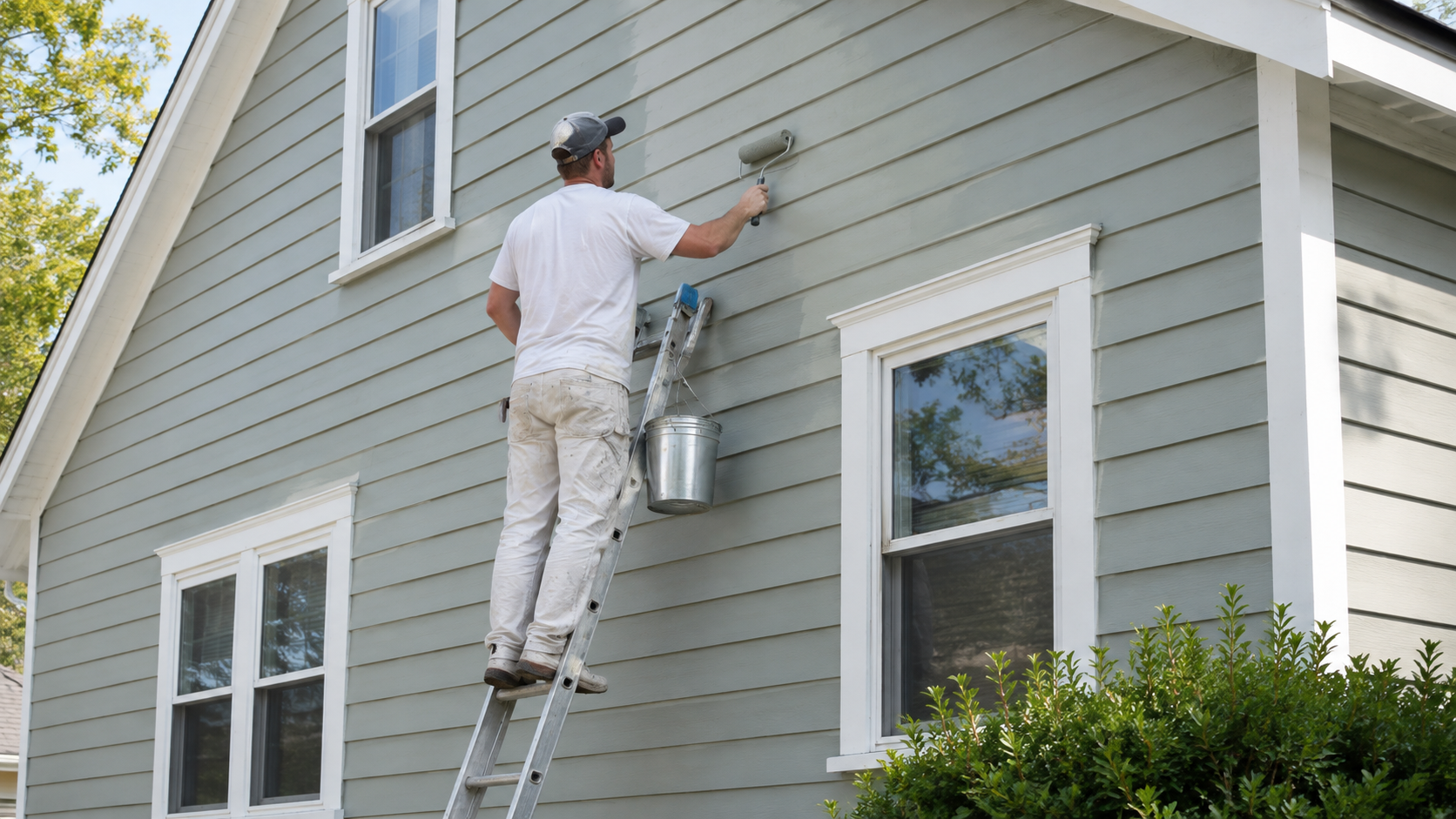
A warm greige body is one of the safest high-return repaint choices many commercial buildings can make this year. It pairs well with black, bronze, white, brick, stone, and wood details. For help choosing a color system that fits your property, Pioneer Painters provides commercial exterior painting for businesses throughout Western MA and Northern CT.
Two-Tone Exteriors and Contrast Trim
The fastest way to modernize an older facade is often contrast. A building does not always need a dramatic color change to look more current. Sometimes the better move is a clean body color with a strong trim color that defines the structure.
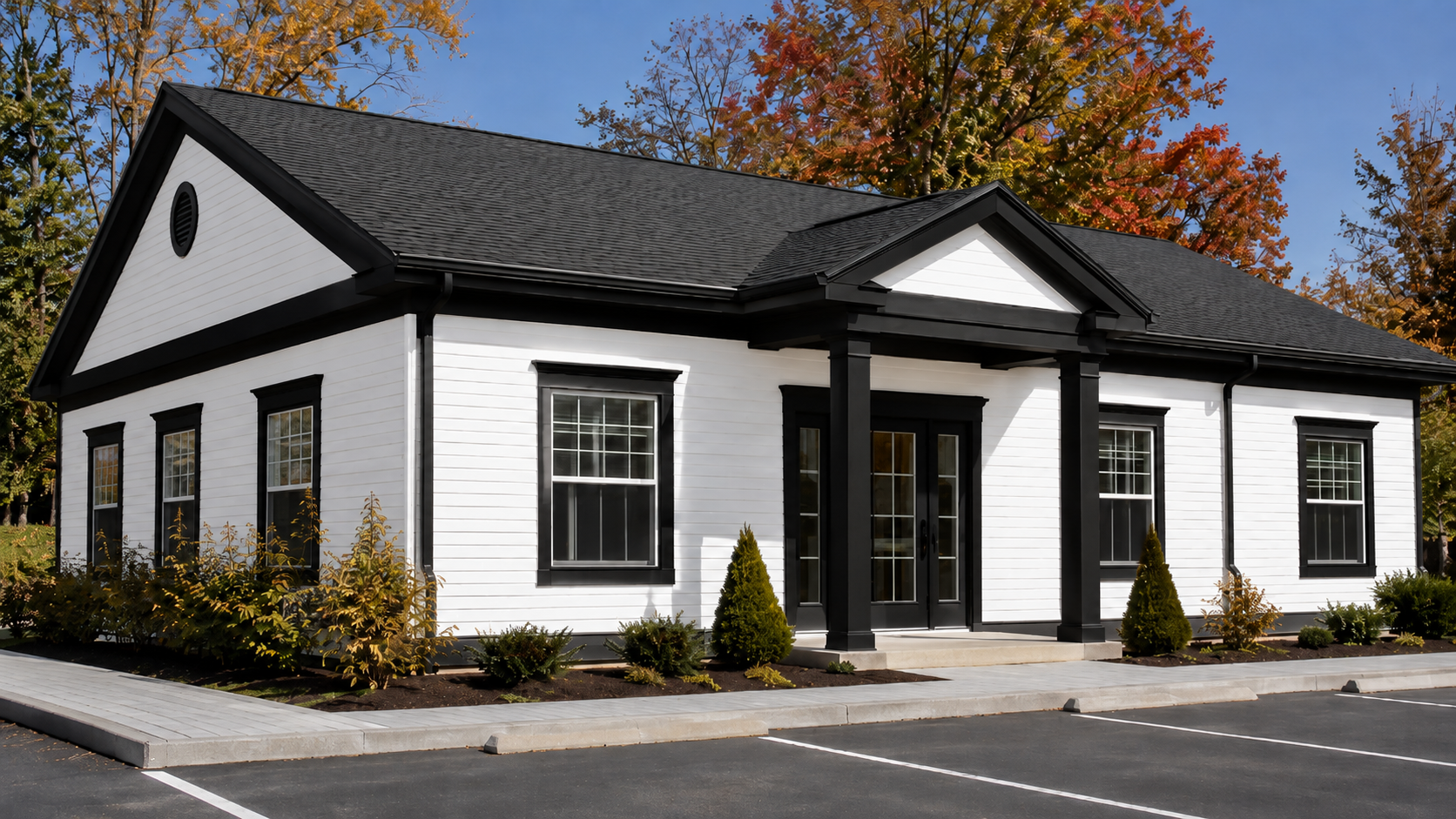
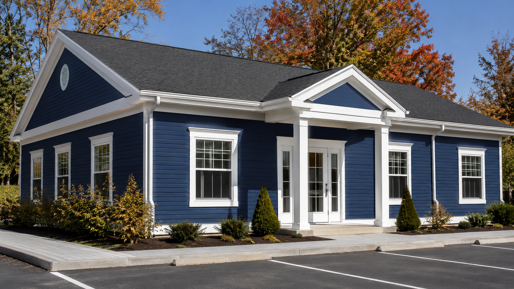
One common direction is a light or warm neutral body with black or bronze trim. Another is a slightly darker body color with clean white trim. The contrast can be used on window frames, fascia, corner boards, storefront framing, awnings, railings, and doors. It helps the building’s lines stand out and makes the exterior feel more intentional.
Contrast trim can change the entire look of a commercial exterior without turning the building into something flashy. The key is restraint. Pick one trim color and carry it consistently across the building. Too many trim colors can make the exterior feel busy, especially on plazas, offices, or multi-tenant properties.
For commercial properties that need a cleaner, more updated look, Pioneer Painters offers commercial painting services for building exteriors, trim, doors, and other painted surfaces.
Which Paint Finish Goes Where
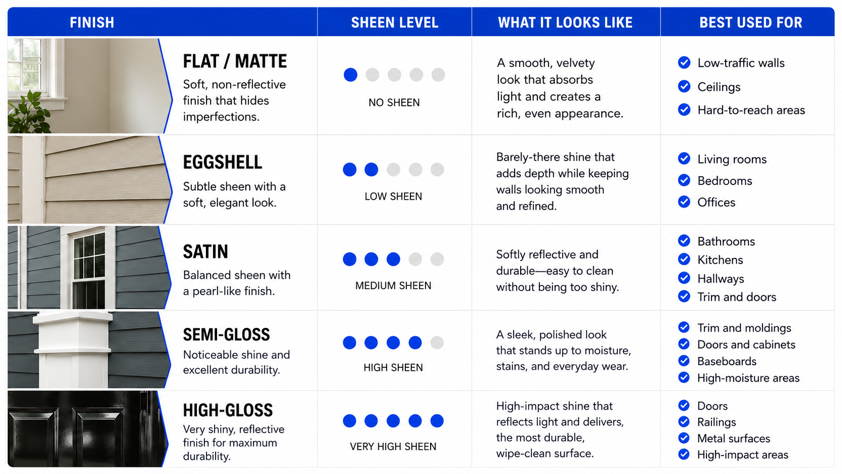
Color gets the attention, but finish determines how the building wears. The right sheen can make a surface easier to clean, help trim stand out, or hide flaws on older masonry. The wrong finish can highlight imperfections or wear out faster in high-touch areas.
Make the Front Door a Statement
Once the body and trim are set, the front door is where a commercial building can add personality. A bold door color can help guide customers, tenants, or visitors toward the entrance while giving the building a more finished look.
Deep red, forest green, navy, bronze, or a strong brand color can all work when the rest of the exterior is calm. For a business with a strong logo color, a door in that color can make the entrance feel connected to the brand. For example, a bold blue like #0247f9 can work well when it matches the company’s signage or identity.
On a retail or office building, the front door is some of the cheapest square footage you can paint and some of the most visible. Semi-gloss or high-gloss is usually the better finish because doors need to handle fingerprints, weather, and frequent cleaning.
Nature Greens and Earthy Accents
Beyond neutrals, muted greens and earthy tones are one of the strongest accent directions for 2026. Behr named Hidden Gem N430-6A, a smoky jade, as its 2026 Color of the Year. Benjamin Moore named Silhouette AF-655, a deep espresso and charcoal influenced color, as its 2026 Color of the Year. Both point toward richer, grounded color rather than flat gray or bright accent colors.
For commercial exteriors, these colors usually work best as accents. A muted green can look calm and credible on a wellness, healthcare, hospitality, or professional building. Terracotta, ochre, bronze, clay, and warm brown accents can also add depth without making the exterior feel loud.
The important part is fit. These colors should support the building and the business. Unless the brand already leans into a strong earthy palette, use these shades on doors, feature areas, trim details, or outdoor structures instead of covering the entire building.
Match the Trend to Your Building Type
The right direction depends on what kind of property you run. A medical office, retail storefront, warehouse, and multifamily building should not all be painted the same way.
- Retail and storefronts: warm neutral body with an accent door to help pull attention toward the entrance.
- Offices and professional buildings: warm greige with black or bronze trim for a clean, modern look.
- Medical and wellness buildings: muted greens and soft neutrals that feel calm, clean, and professional.
- Warehouses and industrial buildings: durable neutrals with coatings selected for performance and weather exposure.
- Multifamily and condos: cohesive neutrals that improve curb appeal across the whole property.
Seeing finished projects can help narrow the direction. Pioneer Painters’ gallery is a useful place to see our commercial work before choosing a color plan.
Don’t Forget the Deck, Patio, or Wood Entry
Commercial exteriors are not only walls and trim. Outdoor seating areas, patios, rooftop lounges, wood entries, railings, pergolas, and decks all shape how the property looks and feels. These surfaces also take more weather and foot traffic than many vertical painted areas.
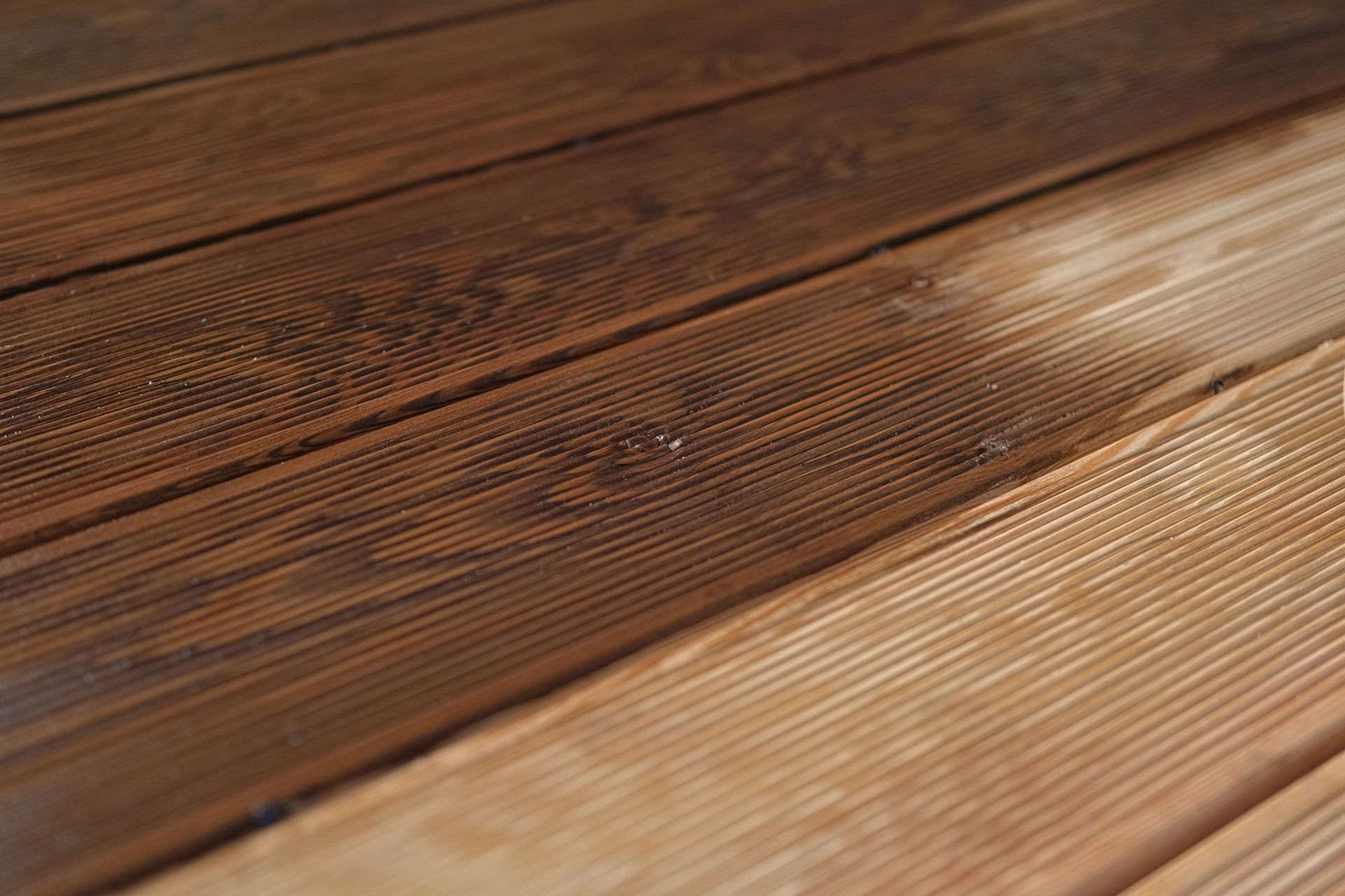
For wood surfaces, stain is often the better choice. Paint sits on top of the surface, while stain soaks into the wood and allows the grain to show. That makes staining a practical option for decks, patios, and wood entries that need to handle weather and use.
A simple way to tell if it is time to restain is to watch what water does on the surface. If water no longer beads, or the wood has turned gray and faded, it may be due. Fall can be a good time for this work because cooler, drier weather helps stain cure before winter freeze-thaw cycles set in.
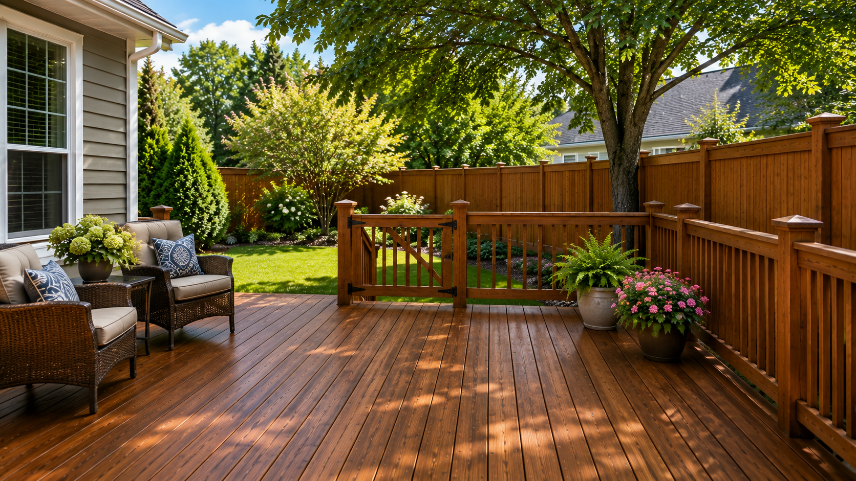
A restained patio or entry deck is a small project that can make the whole property look better maintained. Pioneer Painters also provides deck staining & painting for exterior wood surfaces.
Why Fall Is the Window, Not Spring
Exterior paint and stain need stable, moderate conditions. Fall in Western MA and Northern CT can provide that window before the first freeze, especially for commercial properties that want the work finished before winter weather arrives.
There is also a planning advantage. A fall repaint means the building starts the new year looking ready, instead of waiting for a spring scramble. The work can be scheduled with less pressure, and the property is already protected before winter exposure.
Pioneer Painters serves commercial properties across its local service area, including Longmeadow, East Longmeadow, Springfield, Agawam, Chicopee, West Springfield, Holyoke, Enfield, Suffield, Somers, and nearby communities.
Get a Free Commercial Exterior Estimate
The right colors and finishes, applied before winter, can protect your building and sharpen the way your business is seen from the outside. Pioneer Painters is a local, owner-operated painting company serving residential and commercial clients across Western MA and Northern CT. To talk through your commercial exterior project, call (413) 798-4088 or request a quote.
Frequently Asked Questions
What’s the best paint finish for a commercial building exterior?
Satin is usually best for the main body because it is durable and washable. Trim, doors, railings, and high-touch areas usually call for semi-gloss or high-gloss.
What are the top commercial exterior colors for 2026?
Warm neutrals are leading, especially khaki, greige, taupe, and soft beige. Black or bronze trim adds contrast, while muted greens and earthy tones work well as accents.
Should I paint or stain my commercial deck?
Stain is usually better for commercial decks because it soaks into the wood, shows the grain, and handles foot traffic and weather better than paint on horizontal surfaces.
Recent Blogs